
Building a Custom Segmented Control in Swift
How to Customize a UISegmentedControl: You Don't 🫠


Coding at midnight sounds so romantic and all: you picture yourself as the Lofi girl, bundled snugly in a cozy blanket and oversized headphones. The city lights outside twinkle like distant stars, their soft glow blending with the warm, flickering light of the candle on your desk. With a steaming chai latte in a handmade mug cradled in your hands, the calm tranquility of the world outside wraps around you, broken only by the steady, rhythmic, comforting clatter of your keyboard.
It’s the perfect picture of hygge - ah, life is so damn beautiful.
But some nights, your hair is a wild mess. You’re so wired that you didn’t even notice your music has long stopped playing. Your tea has gone cold, and you feel uncomfortably stuffy under your blanket because you turned off the AC ages ago, convinced you’d be in bed by now. It’s 3 a.m. and you’re bundled in frustration, frantically sifting through a mountain of Slack Overflow tabs, wondering WHY THE HECK can’t I change the background colour of this Segmented Control???
It do be like that sometimes.
Welcome to Building FocusPasta, a blog where I document my journey of building an app from scratch and share my rants and raves about Swift. This post leans more toward the ranty side, but I hope you find it engaging or helpful, maybe even both.
In this post, I’ll walk you through how I created FocusPasta’s custom segmented control, the challenges I faced, and what I learnt from the experience. If you’re in it for the rants, do stick around. If you’re looking for a quick fix, feel free to jump to the bottom for the implementation details.
I hope to save you a solid five hours of frustration - though testing your patience now and then can be a valuable exercise 🙂
What is a Segmented Control anyway?

Apple’s documentation describes a segmented control as a linear set of segments, each of which function as a button. This allows users to choose between multiple options by selecting one segment at a time.
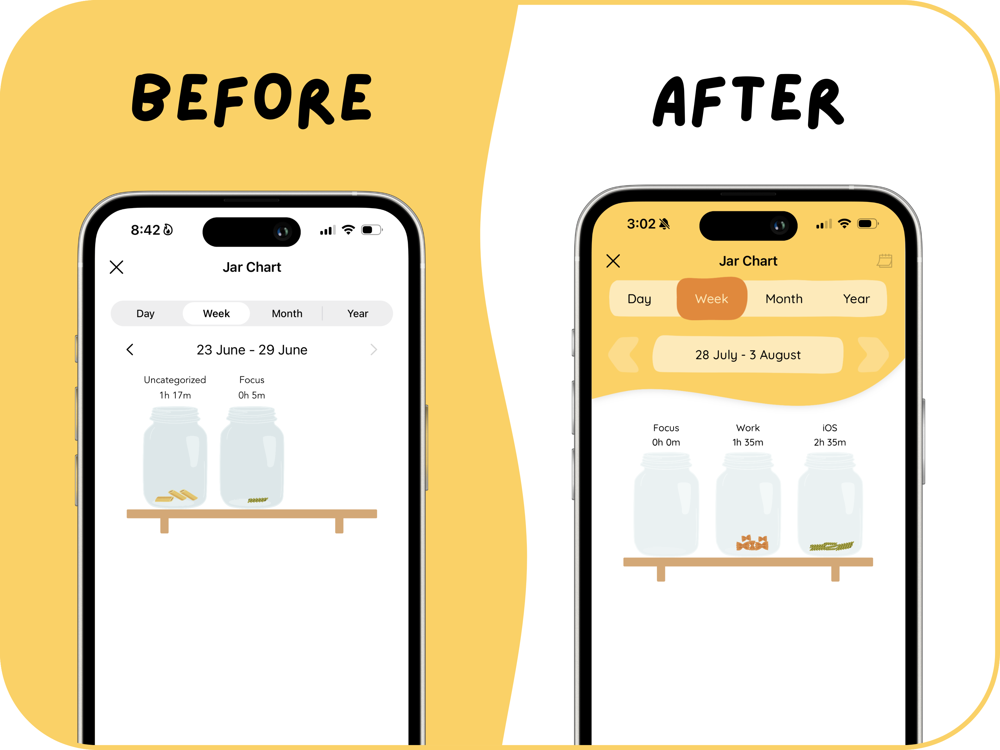
In FocusPasta, I used a segmented control to let users select the time period for viewing their charts - day, week, month, or year - enabling them to track their statistics across different timeframes.

A Simple Setup with UISegmentedControl
Setting up a Segmented Control was pretty straightforward!
All I had to do was to drag the UISegmentedControl component onto my view in the storyboard, add the titles, and create the IBOutlet and IBAction to reference the segmented control in my code and respond to user selections.
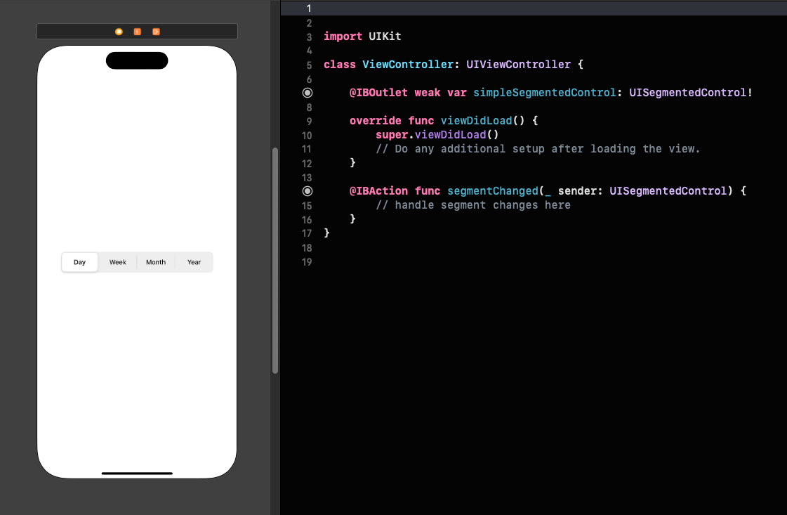
I even found this neat tutorial to make them rounded! (Apple did not make this easy)
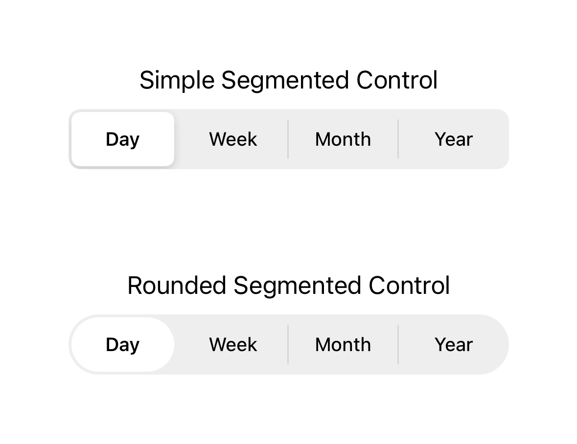
There was only one problem: the default appearance didn’t fit with the design aesthetics of FocusPasta.
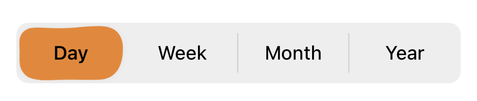
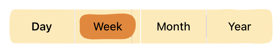
Introducing the BlobSegmentedControl
I took to Canva (which is where the entire FocusPasta was designed) to create a prototype of how I wanted my segmented control to look.
We’re now officially on a mission to bring this to life!
Attempt 1: Replacing UI Images
To create a custom segmented control, I created a BlobSegmentedControl class as a subclass of UISegmentedControl. The goal was clear: I had to replace the default background and selector images with my own.
Replacing the Selector Image
After inspecting the view hierarchy and using numerous print statements, I discovered that UISegmentedControl uses an UIImageView to display the selector for the selected segment. This discovery was exciting, because it means that we can simply replace this image with our own custom design!
Although this specific UIImageView isn’t directly exposed as a variable, this kind fellow on Stack Overflow found a method to identify it based on its index within the subviews array, and I am forever grateful to them.
| class BlobSegmentedControl: UISegmentedControl { | |
| private let segmentInset: CGFloat = 5 | |
| private let segmentImage: UIImage? = UIImage(named: "segmented-control-selector") | |
| override func layoutSubviews() { | |
| super.layoutSubviews() | |
| // Get a reference to the image view representing the selected segment | |
| let selectorIndex = numberOfSegments | |
| guard subviews.indices.contains(selectorIndex), | |
| let selectorImageView = subviews[selectorIndex] as? UIImageView else { | |
| return | |
| } | |
| // Customize the selector image view | |
| selectorImageView.bounds = selectorImageView.bounds.insetBy(dx: segmentInset, dy: segmentInset) | |
| selectorImageView.image = segmentImage // Set the custom image | |
| selectorImageView.layer.masksToBounds = false | |
| selectorImageView.tintColor = .pastaOrange | |
| selectorImageView.layer.removeAnimation(forKey: "SelectionBounds") | |
| } | |
| } |
Great, now we have a segmented control with our own blobby selector!
Replacing the Background Image
Next, we need to update the background with a custom image. Unlike the selector whose image wasn’t directly exposed, there is a method to set the background image: setBackgroundImage. Unfortunately, it didn’t work.
As you can see:
It’s not the shape that I wanted! The lines are too straight, it seems like the image is clipped to its bounds? Or maybe it’s late and I’m starting to hallucinate.
The selector becomes… small? 🤨
I don’t even know why there is a weird line there!
And most importantly! The selector image went haywire.
What in the what the?
I can’t even begrudgingly accept this visual monstrosity because this selector image issue makes the segmented control completely unusable.
This isn’t entirely surprising, as setting a new background image adds a new subview, which means that the previous method of identifying the selector using its index in the subviews array no longer works. This issue is also highlighted in a blog post where the author discovered, through inspecting the view hierarchy, that setting a background image causes the selector’s UIImageView to mysteriously disappear.
Apparently, this has been the case since iOS 13.
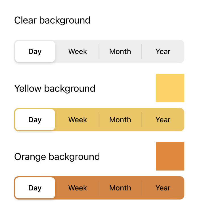
Fine, it looks like we need to find another way. Since we’ve successfully set a custom image for the selector, what if we just set the background color to clear? We can then just place an image of the bar behind the segmented control 👍🏻
Attempt 2: Transparent Bar with Background Image
Unfortunately, the universe has a different plan for me. No matter what color I throw at the UISegmentedControl, it stubbornly reverts to grey. When I set it to clear, it is grey. When I set it as yellow, it is greyish yellow. If I set it as orange, it’s greyish orange!
I made my usual pilgrimage to Stack Overflow, hoping to find a beacon of insight. Instead, I was met with a troubling scene: a pandemonium of frustrated developers in various states of distress and disarray. The community has devised all sorts of elaborate workarounds, some of which were truly impressive. However, after witnessing their desperate struggle, I decided it was best to admit defeat and retreat.
Attempt 3: Building a Custom Segmented Control from Scratch
After a brief interlude involving a bit of tabletop upheaval, I decided to scrap the whole thing and start over.

It then dawned on me that this UI component I have been wrestling with is ridiculously simple - it is just a horizontal stack of transparent buttons. All I needed to do was place a bar image and a selector image behind it.
1. Setting Up the Visuals
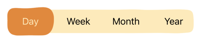
First, we create a custom UIView subclass for our segmented control. This view consists of 3 main components:
An
UIImageViewfor the barAn
UIImageViewfor the selectorA horizontal
UIStackViewcontaining theUIButtons
Here’s how it is implemented:
| class BlobSegmentedControl: UIView { | |
| private var buttons = [UIButton]() | |
| private var titles: [String] | |
| init(frame: CGRect, titles: [String]) { | |
| self.titles = titles | |
| super.init(frame: frame) | |
| setupView() | |
| } | |
| required init?(coder: NSCoder) { | |
| self.titles = [] | |
| super.init(coder: coder) | |
| setupView() | |
| } | |
| private func setupView() { | |
| let barImage: UIImage? = UIImage(named: "segmented-control-bar") | |
| let backgroundImageView = UIImageView(image: barImage) | |
| backgroundImageView.contentMode = .scaleAspectFit | |
| backgroundImageView.frame = frame | |
| backgroundImageView.tintColor = .lightYellow | |
| addSubview(backgroundImageView) | |
| let selectorImage: UIImage? = UIImage(named: "segmented-control-selector") | |
| let selectorImageView = UIImageView(image: selectorImage) | |
| selectorImageView.tintColor = .pastaOrange | |
| addSubview(selectorImageView) | |
| let hStack = UIStackView() | |
| hStack.axis = .horizontal | |
| hStack.alignment = .fill | |
| hStack.distribution = .fillEqually | |
| hStack.spacing = 10 | |
| addSubview(hStack) | |
| // ... set up constraints | |
| setupButtons(in: hStack) | |
| } | |
| private func setupButtons(in stackView: UIStackView) { | |
| for title in titles { | |
| let button = UIButton(type: .custom) | |
| button.setTitle(title, for: .normal) | |
| button.titleLabel?.backgroundColor = .clear | |
| button.setTitleColor(.black, for: .normal) | |
| button.setTitleColor(.lightYellow, for: .selected) | |
| button.backgroundColor = .clear | |
| button.setBackgroundImage(nil, for: .normal) | |
| button.addTarget(self, action: #selector(buttonTapped(_:)), for: .touchUpInside) | |
| stackView.addArrangedSubview(button) | |
| buttons.append(button) | |
| } | |
| } | |
| @objc private func buttonTapped(_ sender: UIButton) { | |
| print("button tapped") | |
| } | |
| } |
In this implementation:
Buttons are styled with clear backgrounds to keep the background and selector images visible.
Button title colors change to a lighter shade when selected, providing contrast against the darker-colored selector image.
Each button is assigned a tap action.
2. Animating the Button Selection
Next, to provide visual feedback for the button selection, we need to animate the movement of the selector. To do this, we need to make selectorImageView a class property so that it can be referenced and its position can be updated.
Additionally, since only one button can be selected at a time, we introduce a selectedButton variable to keep track of the button that is currently selected.
We use the didSet property observer for selectedButton. The didSet observer is a feature in Swift that allows you to execute code immediately after a property has been set to a new value, making it a perfect place to update the position of the selector image whenever the selected button changes.
This is how we modify the BlobSegmentedControl class:
| var selectorImageView = UIImageView() | |
| var selectedButton: UIButton? { | |
| didSet { | |
| guard let selectedButton = selectedButton else { | |
| fatalError("selected button not set") | |
| } | |
| let width = selectedButton.frame.width * 1.1 | |
| let height = selectedButton.frame.height * 1.1 | |
| let newX = selectedButton.frame.midX - width / 2 | |
| let newY = selectedButton.frame.midY - height / 2 | |
| UIView.animate(withDuration: 0.2) { | |
| self.selectorImageView.frame = CGRect( | |
| x: newX, | |
| y: newY, | |
| width: width, | |
| height: height | |
| ) | |
| oldValue?.isSelected = false | |
| selectedButton.isSelected = true | |
| } | |
| } | |
| } | |
| @objc private func buttonTapped(_ sender: UIButton) { | |
| guard sender != selectedButton else { return } | |
| selectedButton = sender | |
| } |
With these changes, when a button is tapped, the following sequence occurs:
The
buttonTappedmethod is triggered.The
selectedButtonproperty is updated with the newly tapped button.This update triggers the
didSetproperty observer forselectedButton.The
didSetobserver calculates the new position for theselectorImageViewbased on the tapped button’s frame.The
selectorImageViewis animated to smoothly transition to the new button’s location.The previously selected button’s appearance is reverted to its default state.
3. Reloading Data When a Button Is Pressed
Buttons are not just there for decoration - they play a crucial role in driving app functionality. In FocusPasta, each button in the segmented control triggers an update and reloads your data from Realm, populating your charts with data that reflect the selected time period.
To achieve this, we use the delegate pattern, which allows objects in Swift to communicate with other objects without being directly connected to them. This allows our BlobSegmentedControl class to stay focused on its main job - sitting still and looking pretty - while leaving the heavy lifting to the delegate.
The Delegate Design Pattern
To implement the delegate pattern, we start by defining a protocol with a method like buttonSelected, which will be called when a button is clicked. Any object that wants to identify as a delegate for BlobSegmentedControl must conform to and implement all the methods defined in the protocol.
In the BlobSegmentedControl class, we declare a delegate property and call the delegate’s buttonSelected method whenever a button is pressed.
| protocol BlobSegmentedControlDelegate { | |
| func buttonSelected(_: Int) | |
| } | |
| class BlobSegmentedControl: UIView { | |
| var delegate: BlobSegmentedControlDelegate? | |
| // ... other code | |
| var selectedButton: UIButton? { | |
| didSet { | |
| // ... other code | |
| if let index = buttons.firstIndex(of: selectedButton) { | |
| delegate?.buttonSelected(index) | |
| } | |
| } | |
| } | |
| } |
Usage Example
In the view controller, we implement the BlobSegmentedControlDelegate protocol to be able to handle the button press events.
| class ViewController: UIViewController, BlobSegmentedControlDelegate { | |
| override func viewDidLoad() { | |
| super.viewDidLoad() | |
| setupSegmentedControl() | |
| } | |
| func setupSegmentedControl() { | |
| let segmentedControl = BlobSegmentedControl( | |
| frame: .zero, | |
| titles: ["Day", "Week", "Month", "Year"] | |
| ) | |
| // ... other code | |
| segmentedControl.delegate = self | |
| } | |
| func buttonSelected(_ index: Int) { | |
| print("Button selected: \(index)") | |
| } | |
| } |
Now, when a button is selected, our BlobSegmentedControl calls the buttonSelected method on its delegate, if one is set. After that, it can wash its hands of the responsibility and happily return to minding its own business.
Full Implementation
Here’s the full implementation of BlobSegmentedControl:
| import UIKit | |
| protocol BlobSegmentedControlDelegate { | |
| func buttonSelected(_: Int) | |
| } | |
| class BlobSegmentedControl: UIView { | |
| var delegate: BlobSegmentedControlDelegate? | |
| var buttons = [UIButton]() | |
| private var titles: [String] | |
| var selectorImageView = UIImageView() | |
| var selectedButton: UIButton? { | |
| didSet { | |
| guard let selectedButton = selectedButton else { | |
| fatalError("selected button not set") | |
| } | |
| let width = selectedButton.frame.width * 1.1 | |
| let height = selectedButton.frame.height * 1.1 | |
| let newX = selectedButton.frame.midX - width / 2 | |
| let newY = selectedButton.frame.midY - height / 2 | |
| var duration = Double(0.2) | |
| if oldValue == nil { | |
| duration = 0 | |
| } | |
| UIView.animate(withDuration: duration) { | |
| self.selectorImageView.frame = CGRect( | |
| x: newX, | |
| y: newY, | |
| width: width, | |
| height: height | |
| ) | |
| oldValue?.isSelected = false | |
| selectedButton.isSelected = true | |
| } | |
| if let index = buttons.firstIndex(of: selectedButton) { | |
| delegate?.buttonSelected(index) | |
| } | |
| } | |
| } | |
| init(frame: CGRect, titles: [String]) { | |
| self.titles = titles | |
| super.init(frame: frame) | |
| setupView() | |
| } | |
| required init?(coder: NSCoder) { | |
| self.titles = [] | |
| super.init(coder: coder) | |
| setupView() | |
| } | |
| override func layoutSubviews() { | |
| super.layoutSubviews() | |
| if selectedButton == nil || selectedButton == buttons.first { | |
| selectedButton = buttons.first | |
| } | |
| } | |
| private func setupView() { | |
| let barImage: UIImage? = UIImage(named: "segmented-control-bar") | |
| let backgroundImageView = UIImageView(image: barImage) | |
| backgroundImageView.contentMode = .scaleAspectFit | |
| backgroundImageView.frame = frame | |
| backgroundImageView.tintColor = .lightYellow | |
| backgroundImageView.translatesAutoresizingMaskIntoConstraints = false | |
| addSubview(backgroundImageView) | |
| let selectorImage: UIImage? = UIImage(named: "segmented-control-selector") | |
| selectorImageView = UIImageView(image: selectorImage) | |
| selectorImageView.tintColor = .pastaOrange | |
| addSubview(selectorImageView) | |
| let hStack = UIStackView() | |
| hStack.axis = .horizontal | |
| hStack.alignment = .fill | |
| hStack.distribution = .fillEqually | |
| hStack.spacing = 10 | |
| hStack.translatesAutoresizingMaskIntoConstraints = false | |
| addSubview(hStack) | |
| NSLayoutConstraint.activate([ | |
| backgroundImageView.topAnchor.constraint(equalTo: topAnchor, constant: 2), | |
| backgroundImageView.bottomAnchor.constraint(equalTo: bottomAnchor, constant: -2), | |
| backgroundImageView.leadingAnchor.constraint(equalTo: leadingAnchor, constant: 2), | |
| backgroundImageView.trailingAnchor.constraint(equalTo: trailingAnchor, constant: -2), | |
| hStack.topAnchor.constraint(equalTo: topAnchor), | |
| hStack.bottomAnchor.constraint(equalTo: bottomAnchor), | |
| hStack.leadingAnchor.constraint(equalTo: leadingAnchor), | |
| hStack.trailingAnchor.constraint(equalTo: trailingAnchor), | |
| ]) | |
| setupButtons(in: hStack) | |
| } | |
| private func setupButtons(in stackView: UIStackView) { | |
| for title in titles { | |
| let button = UIButton(type: .custom) | |
| button.setTitle(title, for: .normal) | |
| button.titleLabel?.backgroundColor = .clear | |
| button.setTitleColor(.black, for: .normal) | |
| button.setTitleColor(.lightYellow, for: .selected) | |
| button.backgroundColor = .clear | |
| button.tintColor = .clear | |
| button.setBackgroundImage(nil, for: .normal) | |
| button.addTarget(self, action: #selector(buttonTapped(_:)), for: .touchUpInside) | |
| stackView.addArrangedSubview(button) | |
| buttons.append(button) | |
| } | |
| } | |
| @objc private func buttonTapped(_ sender: UIButton) { | |
| guard sender != selectedButton else { return } | |
| selectedButton = sender | |
| } | |
| } |
Usage:
| class ViewController: UIViewController, BlobSegmentedControlDelegate { | |
| override func viewDidLoad() { | |
| super.viewDidLoad() | |
| setupSegmentedControl() | |
| } | |
| func setupSegmentedControl() { | |
| let segmentedControl = BlobSegmentedControl( | |
| frame: .zero, | |
| titles: ["Day", "Week", "Month", "Year"] | |
| ) | |
| segmentedControl.delegate = self | |
| view.addSubview(segmentedControl) | |
| segmentedControl.translatesAutoresizingMaskIntoConstraints = false | |
| NSLayoutConstraint.activate([ | |
| segmentedControl.centerXAnchor.constraint(equalTo: view.centerXAnchor), | |
| segmentedControl.centerYAnchor.constraint(equalTo: view.centerYAnchor), | |
| segmentedControl.widthAnchor.constraint(equalToConstant: 350), | |
| segmentedControl.heightAnchor.constraint(equalToConstant: 50) | |
| ]) | |
| } | |
| func buttonSelected(_ index: Int) { | |
| print("button selected: \(index)") | |
| } | |
| } |
And there you have it - a custom BlobSegmentedControl that seamlessly fits the FocusPasta aesthetic!
Conclusion
Navigating the quirks of UISegmentedControl taught me an important lesson in app development: sometimes, it’s better to build custom components from scratch rather than rely on built-in solutions that might become problematic.
As we’ve seen, relying on system components like UISegmentedControl can lead to unexpected challenges, especially when updates alter their behavior or appearance. This was demonstrated during the iOS 13 update, where developers were caught off guard when their previously white segmented controls turned grey.
By opting to build custom components, you avoid putting your app in the hands of fate. You gain complete control over every aspect of its appearance and functionality, protecting your app from disruptive changes beyond your control - unless, of course, Apple decides to change all button shapes to hexagons and insist that all text labels should be in Comic Sans.
In that case, you might as well just embrace the chaos.